Create contrast. When using multiple colors, make sure there is enough contrast between them. The color contrast ratio is a good indication to determine contrast.
Create contrast. When using multiple colors, make sure there is enough contrast between them. The color contrast ratio is a good indication to determine contrast.

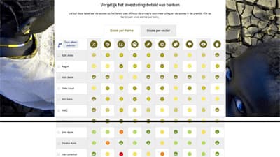
Differentiate clustered elements not only on color. For example graphs or error messages can highly depend on color usage. Make sure colors are not the only way of distinction between different pieces of information.

Test on color contrast. Make sure your website/app keeps on having a good contrast.
